
Flying & Navigation
Hazard Awareness
No sneak peaks with ForeFlight's powerful terrain and obstacle avoidance features.

Watch our latest videos and featured playlists to learn tips, tricks, and best practices for using ForeFlight like a pro.
No sneak peaks with ForeFlight's powerful terrain and obstacle avoidance features.

Plan and fly with industry-leading IFR charts, airport diagrams, and more in ForeFlight.

Get the full weather picture, from up-to-the-minue radar and satellite to global forecast layers.

Learn about powerful and underutilized features, whether you're brand new or a ForeFlight veteran.

Complete aircraft profile information is critical to accurate flight currency reporting - ForeFlight Logbook highlights missing information to help your currencies stay on track.

Tap to learn about airspace, map elements, and more using the Maps view’s information Sidebar, which lets you dig into details while still interacting with the map.

ForeFlight’s Alternate Advisor simplifies the process of choosing a good alternate airport by providing a list of suggestions to help you narrow your options.

Easily add a visual approach or traffic pattern entry to your route with a customizable pattern altitude.

Checklist Speak allows you to complete your checklists more efficiently by having ForeFlight read them to you.

ForeFlight's TOLD feature for pistons allows you to specify a safety distance factor to produce more conservative runway performance calculations in response to runway conditions or other factors.
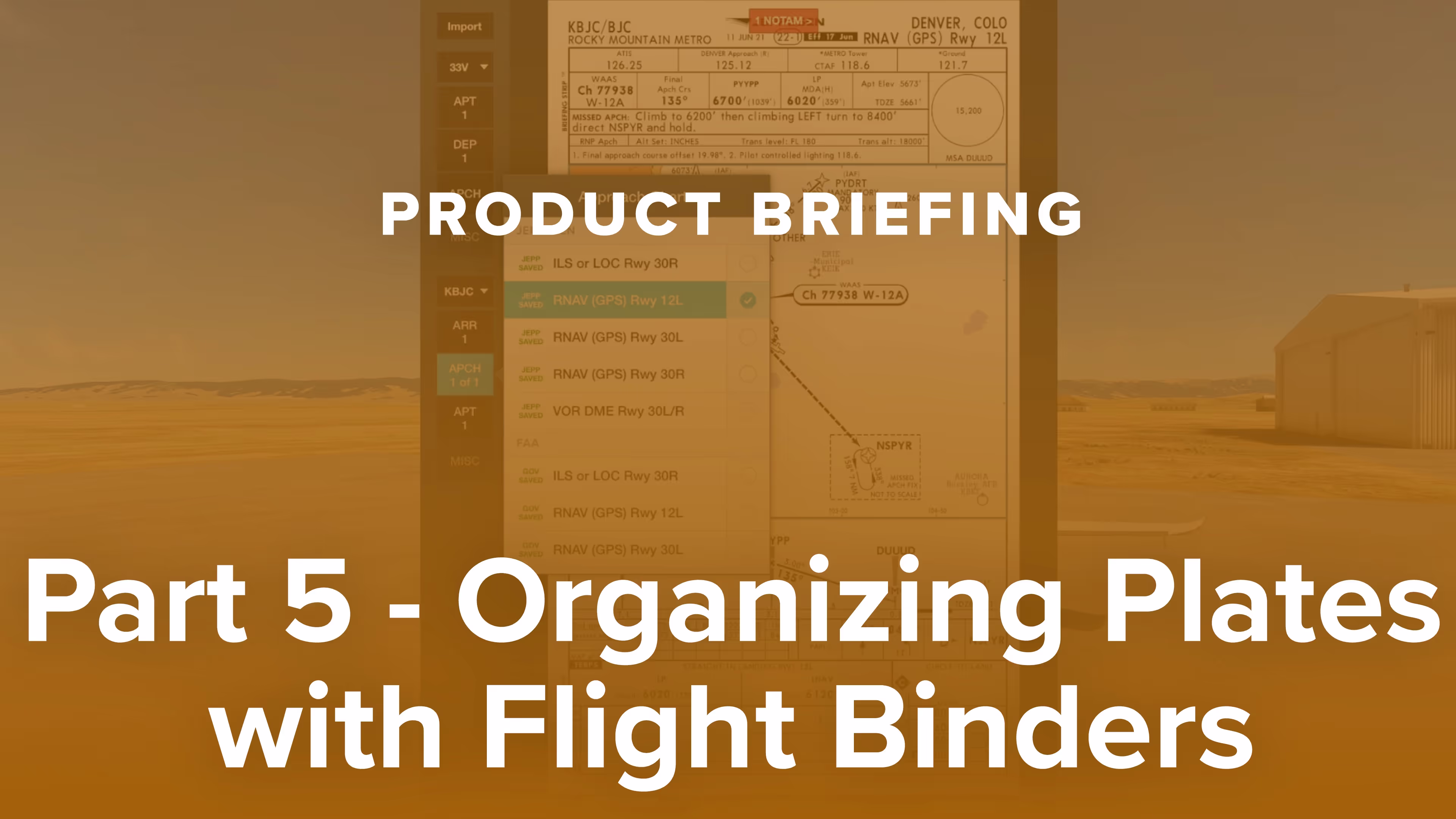
Learn to use ForeFlight’s Flight Binders to organize Jeppesen charts for any flight and navigate between plates easily using the 3-finger swipe gesture in this real-world flight demonstration.

Why do pro pilots prefer Jeppesen over FAA plates, and what makes them valuable for GA pilots? Find out in this FlightInsight video comparing chart formats and key benefits of Jeppesen plates.

Discover how Jeppesen charts became the aviation standard, what sets their format apart, and how their features simplify IFR flying for General Aviation pilots in this FlightInsight collaboration.

Explore how Jeppesen’s SID and STAR charts outperform FAA versions with terrain data, georeferencing, and more—plus a look at their data-driven IFR enroute charts with FlightInsight.

Jeppesen airport diagrams offer more clarity and detail than FAA taxi charts. See how they enhance taxi briefings with rich data, frequencies, and filing info in this video from FlightInsight.

This presentation, given at EAA AirVenture in Oshkosh, Wisconsin, is an advanced, scenario-based course on flying with ForeFlight.

ForeFlight's weather layers use an interactive time slider tool that provides more control when viewing and animating weather timestamps.

Take notes on the fly and mark up charts using ForeFlight's Map Annotations feature. Tap the Annotations buttons on the Maps view to enter Drawing Mode, and use a finger or stylus to draw on the map.

ForeFlight allows you to search for aircraft tail numbers, call signs, and flight numbers on the Maps view to see recently filed flight plans and load them into your route.

ForeFlight's Logbook can automatically suggest photos that you took during a flight so you can quickly review and add them to new Logbook entries.

The Pack feature for downloading charts and weather before a flight is available on the Flights view, making it more accessible as part of ForeFlight's planning workflow.
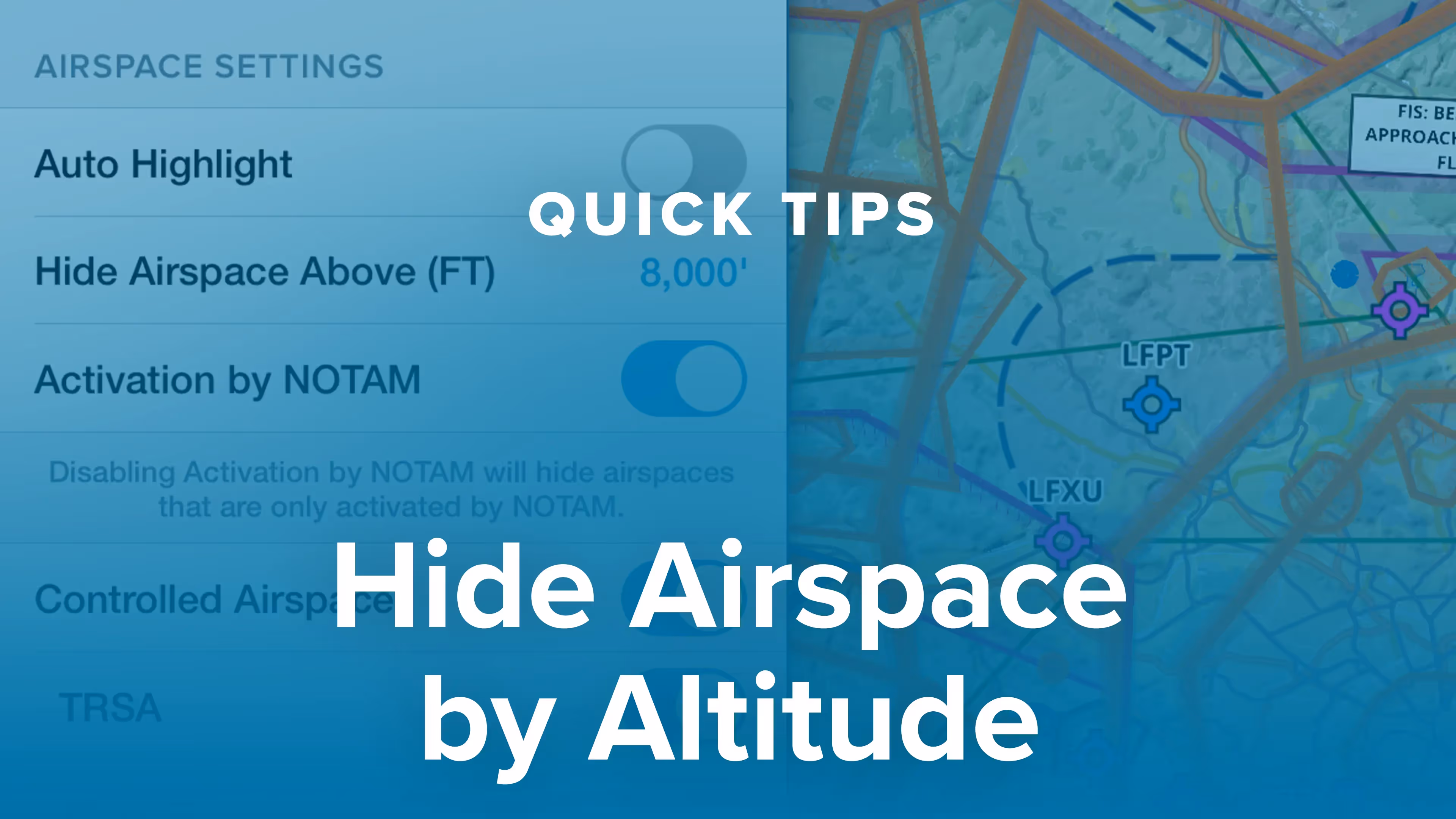
You can declutter ForeFlight's Aeronautical Map by hiding any airspace above a selected altitude, making it easier to focus on airspace closer to you.

ForeFlight provides advanced global airspace details for FIRs, UIRs, and other airspace types, with important information about frequencies, cruise altitudes, and operational notes.

Customizing ForeFlight's look and feel is easier with the App Theme selector, and the Auto Day/Night setting helps your eyes adjust to changing light levels.

Checking your destination airport's weather is an important step in any pre-landing checklist. Like a helpful co-pilot, ForeFlight automatically displays the weather frequency as you near the airport.

The Device Disconnect Alert allows you to quickly take steps to restore a dropped connection to a third-party device or switch to an alternative data source.

ForeFlight Checklist integrates one of the most important inflight tools into the app you already use for every stage of flight, reducing cockpit clutter and providing an intuitive, simple interface.

Ensure a safe takeoff and landing with Runway Analysis, an advanced runway and obstacle analysis product for turbine aicraft that's seamlessly integrated with ForeFlight's existing workflows.